How to Measure AI ROI: The Outcomes Chain Framework
By Peter Maddison ·
The metrics told a clean story.
GitHub Copilot deployed across the engineering org. Developer satisfaction up. Pull request volume at an all-time high. By every indicator on the dashboard, the AI rollout was working.
Release cycle time hadn’t moved.
Features were taking exactly as long to reach customers as they had before the tools arrived. The gap between “merged” and “in front of users” was unchanged. The team had gotten faster at writing code. The system around them hadn’t changed at all.
When we traced where work was actually stalling, the answer took about twenty minutes to find. A single architect review gate touched every major feature. One person. No deputy. No documented criteria for what triggered the review or what “done” looked like.
No amount of faster coding was going to clear that gate. The bottleneck wasn’t where the metrics were pointing. Sadly, the source of the bottleneck isn’t always so obvious.

The measurement problem
This isn’t a story about AI failing. It’s a story about measuring the wrong things.
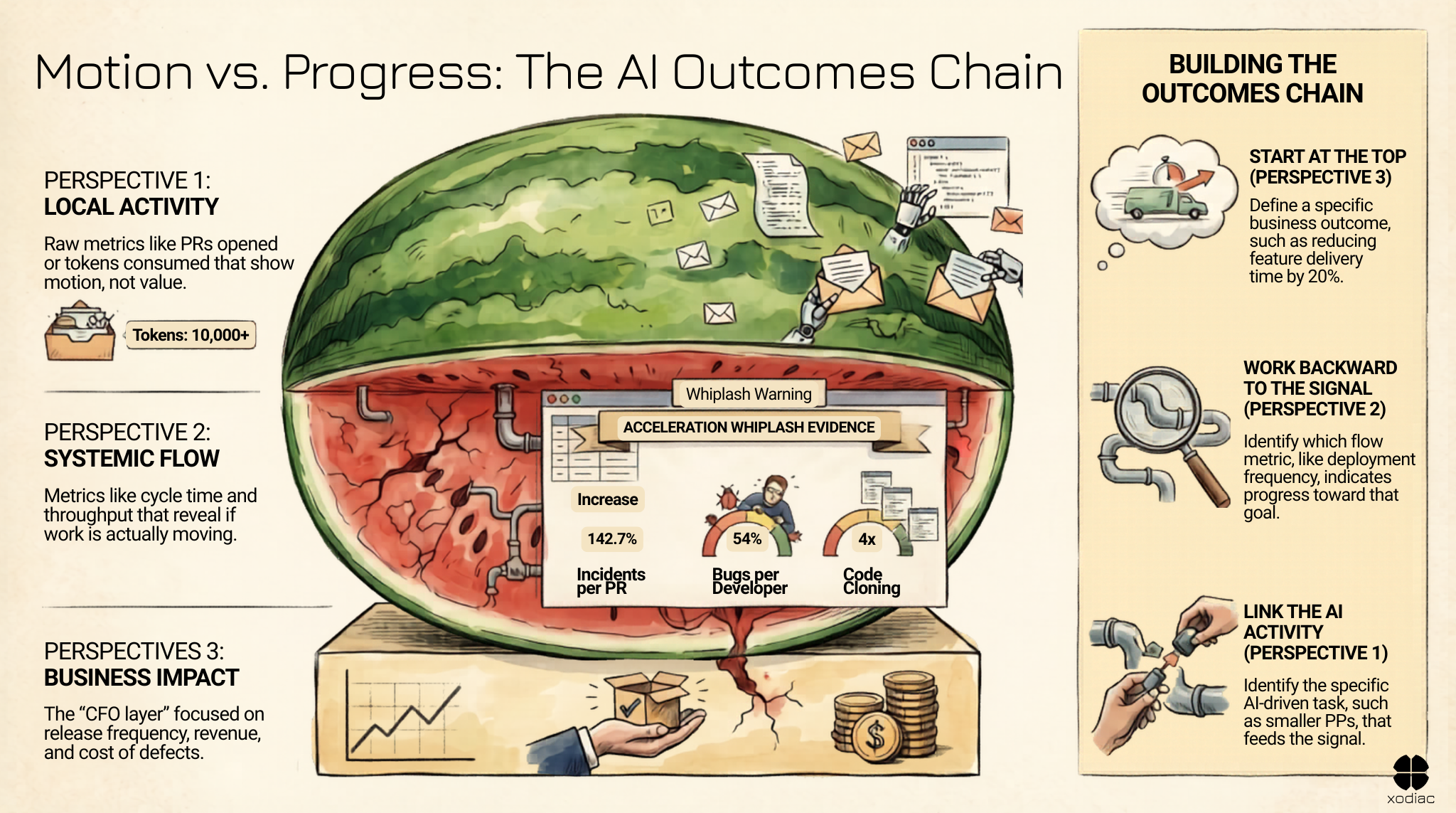
Activity metrics – PRs opened, tasks completed, tokens consumed – are easy to collect and easy to present. They show motion. Leaders can see the dashboard, the numbers are going up, and it feels like progress. This is the pattern behind watermelon metrics – green on the surface, red on the inside.
But motion and progress aren’t the same thing. Motion is local. Progress is systemic.
The research is starting to reflect this. Faros AI’s 2026 Acceleration Whiplash report – two years of telemetry from 22,000 developers across 4,000 teams – found a 54% increase in bugs per developer alongside a 51% increase in PR size. GitClear’s 2025 research found code cloning up 4x – copy/paste code exceeding refactoring for the first time in their dataset.
Faros also found a 242.7% increase in incidents per PR in high-AI-adoption teams.
None of this is an argument against AI tools. It’s an argument for measuring what actually matters – and for building the chain from AI activity to business outcomes before you draw conclusions about value.
Three perspectives, one chain
The organizations that are getting real ROI from AI have learned to think across three perspectives:
Activity perspective: PRs, deploys, tasks completed, tokens used. This is where most AI dashboards stop. It’s useful as raw material. It’s not useful as evidence of value.
Flow perspective: cycle time, throughput, quality rate, defect escape rate. This is where you start to see whether activity is translating into the movement of work. It’s where you find the bottlenecks.
Business impact perspective: release frequency, customer outcomes, cost of defects, revenue per engineer. This is where the CFO lives. This is where investment decisions get made.
Most AI metrics stop at activity. Some reach flow. Very few connect to business impact.
The outcomes chain is the thread that runs from the activity perspective through to business impact. Without it, you have activity data. With it, you have evidence.
Building the chain
Start at the business impact perspective. What is the business outcome you’re trying to influence? Be specific. Not “improve developer productivity” – that’s a direction, not an outcome. Something like: reduce time from feature request to customer delivery by 20%. Or: reduce the cost of a production incident by half.
Then work backward. What flow metric signals progress toward that outcome? For “time from request to delivery,” that’s probably cycle time and deployment frequency. For “cost of production incidents,” it’s change failure rate and mean time to recover – two of the four core DORA metrics used to benchmark engineering delivery health.
Then work back one more step. What activity feeds that flow metric? PR size correlates with cycle time – smaller PRs typically move faster and get reviewed more thoroughly. Defect injection rate (bugs per PR) feeds directly into production incident cost.
Now you have a chain. An AI tool that helps developers write smaller, more focused PRs should improve cycle time – which should contribute to faster delivery. That’s testable. You can measure it, not just assert it.
What the chain reveals
Going back to the team with the architect review bottleneck: once we mapped the outcomes chain, the problem became clear immediately. Their activity metrics (PR velocity) were improving. Their flow metrics (cycle time) were flat. The gap was the constraint.
The chain didn’t just identify the bottleneck. It told them exactly where to intervene. Not more AI tooling. Not more developers. A clearer process around the architect review – what triggers it, who else can do it, what “done” looks like.
That intervention took three weeks to implement. The release cycle moved in the first month.
A simple test
For any AI investment you’re currently making, ask this: can I connect this activity to a business impact outcome in three steps or fewer?
If yes, you have a chain. You can measure it, report on it, and make decisions based on it.
If no, you have activity data. Which is fine as a starting point – but it’s not evidence of value, and it won’t hold up when the CFO starts asking hard questions about the bill.
The organizations that will be able to confidently say “our AI investment delivered X” in 18 months aren’t the ones that measured the most. They’re the ones that measured the right things – in the right sequence. Research into why AI adoption disappoints shows the organizations that see real ROI are almost always the ones who understood how work actually flowed before they deployed new tools – so they could measure what changed, not just what moved.
If you’re not sure where to start, The AI Train Problem covers the three gaps that make this chain hard to build: spend visibility, model governance, and outcomes connection. It’s a useful read before you map your own chain.
Where to start
One of the hardest questions to answer about AI investment is the one in the middle of the chain: can you trace your spend back to a specific business outcome? Most technology leaders can’t – not because the data doesn’t exist, but because the measurement framework does.
The AI FinOps Cheat Sheet gives you a four-dimension framework to start building that picture: cost attribution (who is spending what, on what), value signal (is the spending producing useful outcomes), efficiency (are prompts and workflows well designed), and governance (who controls what, and do you know when it goes wrong).
It also includes five diagnostic questions to bring to your team this week.
If you want to talk through what you find, reach out to Dan at dan@xodiac.ca.